Client:
The Wick Lab
Project Duration:
1 Month
Project Overview
As a user experience team, we decided to make some promotional stickers to give to users to promote our user testing program. We designed two initial stickers, and then tested them with users in order to develop the final sticker design.
Research Journey
The goal of this project was to learn more about what users prefer when it comes to words and imagery on promotional stickers.
For this project, I used both qualitative interviews as well as a quantitative survey. This project was one of my first at the library, so our user testing pool was not yet as large. I knew this meant I would not get as many interviews, which is why I supplemented the data with survey responses.
For both the survey and the interviews, I separated the questions I asked about the stickers into two categories of the words used on the stickers and the images/aesthetic of the sticker.
Qualitative Interviews
For the interviews, I created a slide deck to use while asking the interview questions so that it was easy for the interviewee to follow along. The slide deck is included at the end of this section.
I asked the following interview questions:
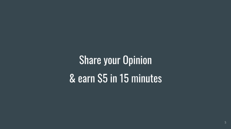
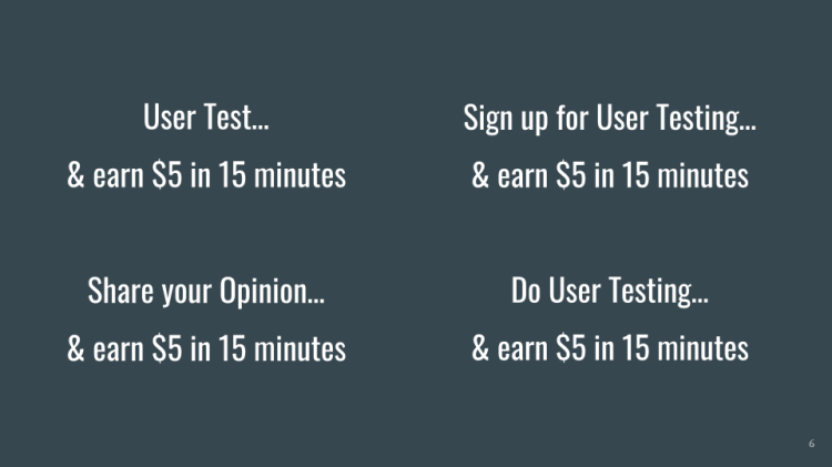
- Phrase on Stickers
- I showed each of phrases in the slide deck one by one, asking the following questions about each:
- When you look at the following statement, what do you think? What does it mean to you?
- What do you feel is most important to know within these words?
- What does this text encourage you to do, if anything
- What words would you use to get our message across?
- After looking at each phrase individually, we looked at the slide with all the phrases side by side, and I asked which phrase they liked best
- I showed each of phrases in the slide deck one by one, asking the following questions about each:
- Images on Stickers
- Each image had placeholder text not related to the project so that the words chosen on the sticker did not affect user perception
- I showed each of the two images on the slide deck one by one, asking the following questions about each:
- What/how does this image make you feel?
- What do you like about this image?
- What do you dislike about this image?
- Would you change anything about this image? Why?
- How do you feel about the text placement in this image? (the link, the main heading, subheading, caps, lowercase, fonts, etc)
- I then showed the slide of both images side by side and asked which is their favorite, why, and if they had any other comments about the stickers overall.

Quantitative Survey
For the quantitative survey portion of the research, I decided to focus more on the aesthetic of the stickers and less on the words used, as I wanted the survey to be quicker to complete for users. Below is a PDF of the survey given to users.
Results of Research
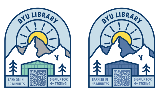
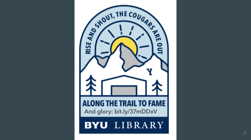
- Feedback on the Mountain Sticker
- Like: The sun and the general feel of the illustration as being more natural, the different arched shape.
- Dislike: The library building in the center doesn’t match the rest of the sticker with its straight lines, fades into the background more. The BYU library font doesn’t match the rest of the sticker (only one person mentioned this)
- Observations: Some felt it looked more obviously like an advertisement, like it would be a devotional or camp or other type of logo.
- When chosen as the favorite, the mountain sticker seemed to be liked because it looked “cool” or more like the type of stickers people normally put on their water bottle, and the unique shape was also mentioned as something people enjoyed.
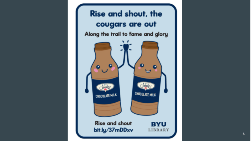
- Feedback on the Chocolate Milk Sticker
- Like: Very cute and fun, unique and helps people visualize the reward.
- Dislike: Not everyone loved the font choice, but agreed it fit with the cuter vibe of the sticker. The rectangle shape made people feel it would be harder to actually use as a sticker
- Observations: Overall more playful and cute of a design, but it might be less likely to actually be used as a sticker, “feels more like a flyer”.
- When chosen as the favorite, the chocolate milk sticker seemed to be liked because it was “unique” and “cute” and different than other things that people have seen.
- Feedback on Word Choice
- The words “User Testing” by themselves give a more negative connotation, (stress, technology, work, annoying, ugh, research study) but using “share your opinion” first helps soften the apparent “work” of it.
Project Results
My Recommendations:
- Make the stickers less like a promotion, and smaller (no more than 3 inches tall) so that people are more likely to stick them on something
- The mountain sticker is more generic, which means it might not be as unique and eye catching, but people may be more likely to make the decision to stick it somewhere, so I think we should go with that general design
- The library on the mountain sticker should be more defined, and we should use fewer words.
- I think the versions of the stickers with “share your opinion” on them have a good mixture of the feedback given and would work the best. The other option would be to change it to be less advertise-y and come up with text more generic BYU or UX or Library, something fun, and then have the link to sign up introduced that way.
- The link should be a QR code so things look less wordy, and students will be more inclined to use it (Note: look into dynamic QR codes to be able to change where the link goes if necessary)
- Things to ensure are in the text: $5, sign up, BYU library (maybe IT/UX)
- Keep the chocolate milk design on the back burner, it could be re-designed and used one day.