Client:
BYU Library
Project Duration:
3 Months
Project Overview
The purpose of this project was to redesign the library maps to update the floor plans, and make them easier for users to navigate. Because I joined this project after its initial start, my research focused on testing and developing prototypes rather than exploratory research.
Research Journey
Because I joined this project in the prototyping phase, I focused on user interviews testing the prototypes of the maps we had created. The goal of the interviews was to find out how often and where the maps were used, what library maps are most often used for, and how colors, icons, and patterns affected usability.
I asked the following interview questions, organized into three sections.
- Section 1: To discover usage of maps
- When do you use the library maps?
- Where do you use library maps? (ie in certain part of library, or digitally)
- What places in the library are most important to you? (ie, what are you usually looking for on a library map?)
- When was the last time you used a library map? What was your goal?
- Section 2: The user walks through one of the following tasks in order to spend some time using the map in a directed way
- You’ve reserved study room (name specific room) and now need to find it.
- You need to find a water fountain to fill up your water bottle
- You are looking for a book in the science section and now are looking to find it in the library
- You want to go to the no shh zone (or snack zone) with friends, how do you get there?
- Section 3: To discover how colors, icons, and patterns affect the usability of the map
- What are your thoughts about the legend?
- What do you think of the legend grouping? (ie, is it intuitive? Would you change anything?)
- Do you see any missing information?
- How do you feel about the colors of the map? The patterns?
- Is there anything you would add to this map?
- Anything you would take away?
- Do you prefer the grayscale or color version of this map? Why?
I showed the following prototype images of maps in a rotation in order to receive an equal amount of feedback for each version, ensuring that the grayscale image was shown in every interview.

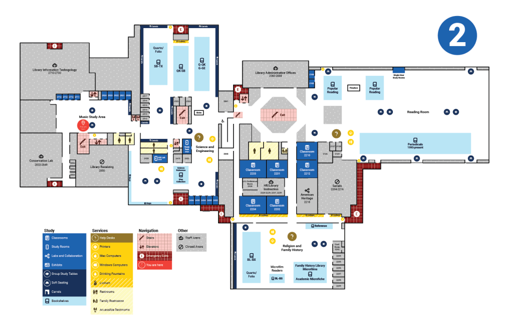

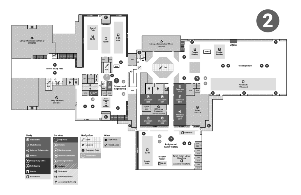
I interviewed 20 users and divided my findings into sections of Navigation/Map Elements, Icons, Colors/Patterns, and Legend.
Navigation/Map Elements
- Student did not know what “carrels” were, I had to look at the map intently to figure out they were the individual private desks on the walls
- Recommendation: Use either a different name or a different symbol, such as dots, to indicate carrels
- It is difficult to understand how large the group study area is, or how many tables exist in that area. Similar thoughts were brought up with knowing the amount of computers in an area
- Recommendation: It might get too messy to put more information in this section, perhaps a small number to indicate the amount of a resource in an area, but it may not be worth it to change this aspect of the map.
- Navigation was difficult to see for the users who used the maps with yellow navigation color.
- Recommendation: Navigation being red would make more sense, as red is more universally associated with “emergency”. Not everything has to be red, but incorporating it more so that it can be more easily recognized would be helpful
- The map is difficult to use/comprehend digitally as it requires lots of zooming in and not being able to see the legend or where you are in the map.
- Recommendation: It would be useful to look into a better digital option that is more user friendly.
- Are there “no shhh” zones on every floor? are there volume levels in different areas or is it silence or no shh?
- Recommendation: Create a volume level guide to add onto the map for each area
Icons
- Group study areas and soft seating have similar icons it is hard to tell the group study area icon is a table
- Recommendation: This might be better when the map is large, but changing the icons to better differentiate them would be helpful
- The help desk icon is hard to tell it’s a question mark
- Recommendation: Use a different question mark or “i” or “!”
- The “you are here” is not super obvious
- Recommendation: Ring it in red or change the color to make it contrast more
- The labs & collaboration symbol being the “share” symbol on phones might be slightly confusing because its being used in a different context
- Recommendation: Use a different collaboration symbol to avoid confusion
Colors/Patterns
- People overall preferred the colored map. The color-blind users also preferred the colored map. They did say the gradient was a bit confusing as the colors looked similar, but they were able to figure it out
- Recommendation: Use the colored version of the map
- Overall the patterns were seen as ok, one user thought it made things more confusing overall, and another brought up that the grids in the navigation areas were confusing because they weren’t sure if the grid was trying to indicate/symbolize something extra.
- Recommendation: Due to the patterns being meant for color-blind people, I would opt to keep them as an accessibility feature
Legend
- The legend having blocks for the circle icons can be a bit confusing, users were expecting a solid area and not a circle (especially in grayscale for some reason)
- Recommendation: Adjust the legend so that the circle icons are easier to be understood as symbols on the map. (rounding edges, separating from legend, etc)
- Legend is not arranged from dark to light for all areas, not a huge deal but something someone noticed
- I do not feel this is a high priority complaint, but colors could be changed in the legend to make them all arranged by color.
Project Results
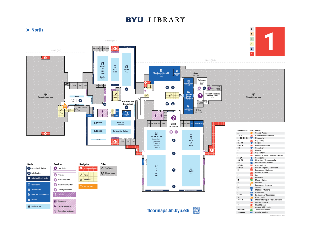
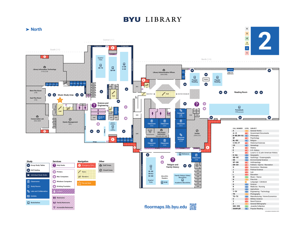
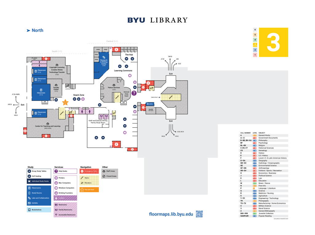
My research and recommendations led to the above final version of the maps, with the following revisions coming directly from my research:
- Navigation
- The emergency exit color was changed from yellow to red to enhance readability in an emergency
- Cardinal directions were added to help users understand where they were in the building
- A QR code was added so that users would be able to continue looking at the map on their phones as they navigate to their destination
- Icons
- The group study tables, soft seating, individual study desks, labs and collaboration, and you are here symbols were all adjusted for better understanding at a glance.
- Legend
- The legend separated different features in order to increase readability
- The legend visualized the difference between icons and larger spaces on the map using the dark solid shape for spaces and rooms, and using a circle shaped icon within the square to show a reference to an icon, without disrupting the shape of the legend.
- What was once “Carrels” became “Individual Study Desks”, as users were unfamiliar with carrels and did not understand what they were.
